
Evaluation of the DeepDyve Website Usability
Executive Summary
- DeepDyve is one of the top research search engines.
- We evaluate the usability of the DeepDyve website.

Introduction
DeepDyve is a website that provides paid access to research articles. I will review this website for usability.
Our References for This Article
If you want to see our references for this article and related Brightwork articles, visit this link.
Introduction

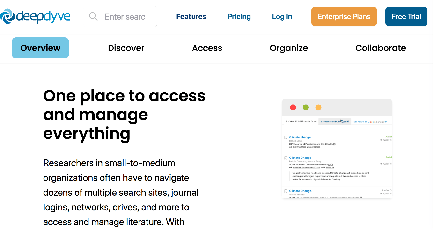
Before we get to the actual search engine, I wanted to review how DeepDyve introduces itself and explains it. Several things came across when reading the website’s explanatory information.
- The explanations are well written and very accurate (I was a relatively frequent user of DeepDyve a few years ago, so I know what they do)
- The website does an excellent job of explaining the value of subscribing to the service.
Here is more about how the DeepDyve website works.

The functionality is straightforward. One types in the interest area and then receives results. One can use minus signs, just as in Google, to remove irrelevant search terms.

Once into the article of interest, the viewer receives a sample of the article, usually the beginning of the article. As articles typically have a synopsis at the beginning, this gives a good idea of whether the article will interest the reader.

Here I narrowed the search by adding covid to the search term, and the number of results naturally declined from 157,111 to only 4,503.

At the bottom is the number of results pages, and then one can adjust the results per page.

Another nice feature is that one can select a preview, which shows the article’s abstract. Any article can be added as a bookmark, so saved to be reviewed later.

Within this view, the citations can be viewed as well.

At the top of every article, the full title, authors, and volume within the journal are available to read. The options for downloading the PDF or sharing text are available. Everything on the site is very natural. I never found myself guessing. This website flows very well, and everything I can think of doing is easily within reach.

This is in the same view, but I have selected references. So I can review the references without scrolling to the bottom of the article. I have followed a similar approach with this website, adding the references to a separate article instead of the articles’ end. You can review the references for all the articles in this category of UX research at this link.

Something new since I used the website is the ability to share folders with colleagues. This must be very advantageous for research teams.
Conclusion
DeepDyve offers a tremendous service and received top scores for explaining how the website works and the value it provides, but its functionality for actually using the services, which is finding, reading and saving, and even sharing articles. I rarely come across a website I can’t think of any way to improve.
Something else of note is how singular in purpose the website is. Many websites clutter their primary purpose with items that are ancillary to what the visitor is there for. DeepDyve keeps the focus very narrow. Consequently, the website feels “small” even though it is one of the more content-heavy websites on the web.
DeepDyve receives a 10 out of 10 for its usability.