
Think Design: A Review of The Websites of UX Companies
Executive Summary
- Companies offering UX consulting and other services should have very usable and effective websites.
- We review them to see how they stack up.

Introduction
UX companies should have terrific websites. In this case, we review the website of Think Design.
Main Entry
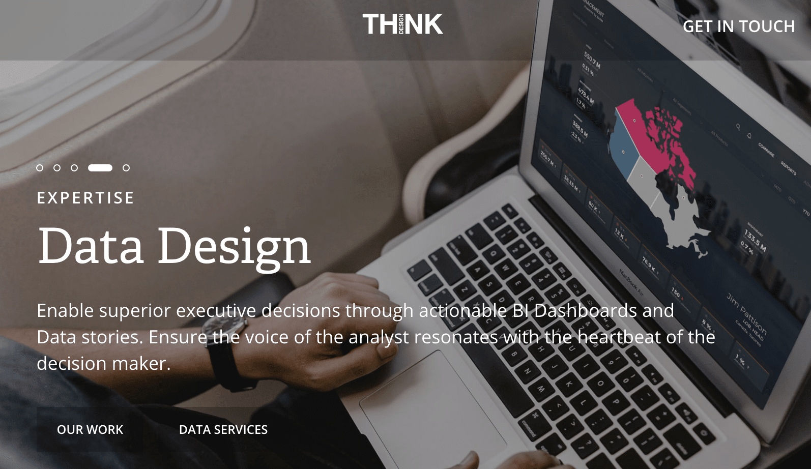
The first page of Think Design looks good. The UX is to scroll to see more and more of what Think Design does.
The Menu
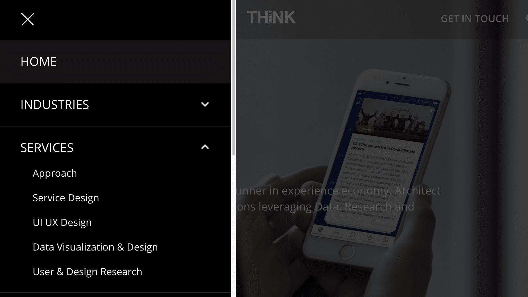
The menu is to the right, and we give high marks. It is easy to navigate but also fits a lot of choices into the space.
The Think Design Services
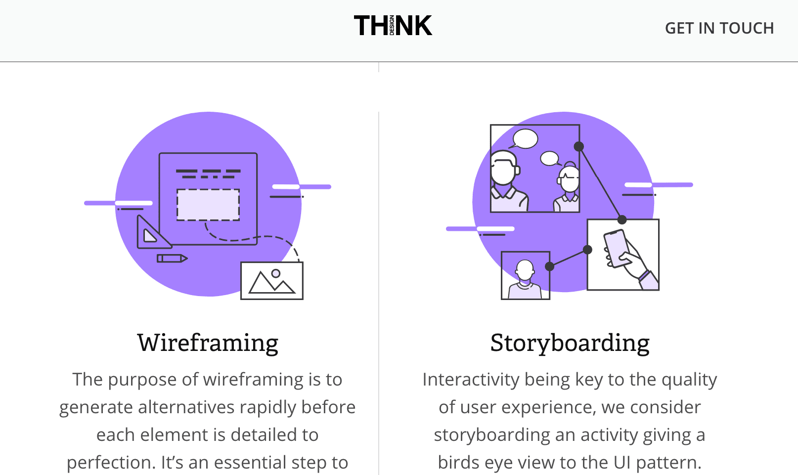
Like many UX companies, Think Design includes its explanations of services in tiles. The UX writing is compelling and clear. Without becoming tedious, it is easy to understand what Think Design offers, as this area often is. Think Design does an excellent job of explaining what they do and why they do it.
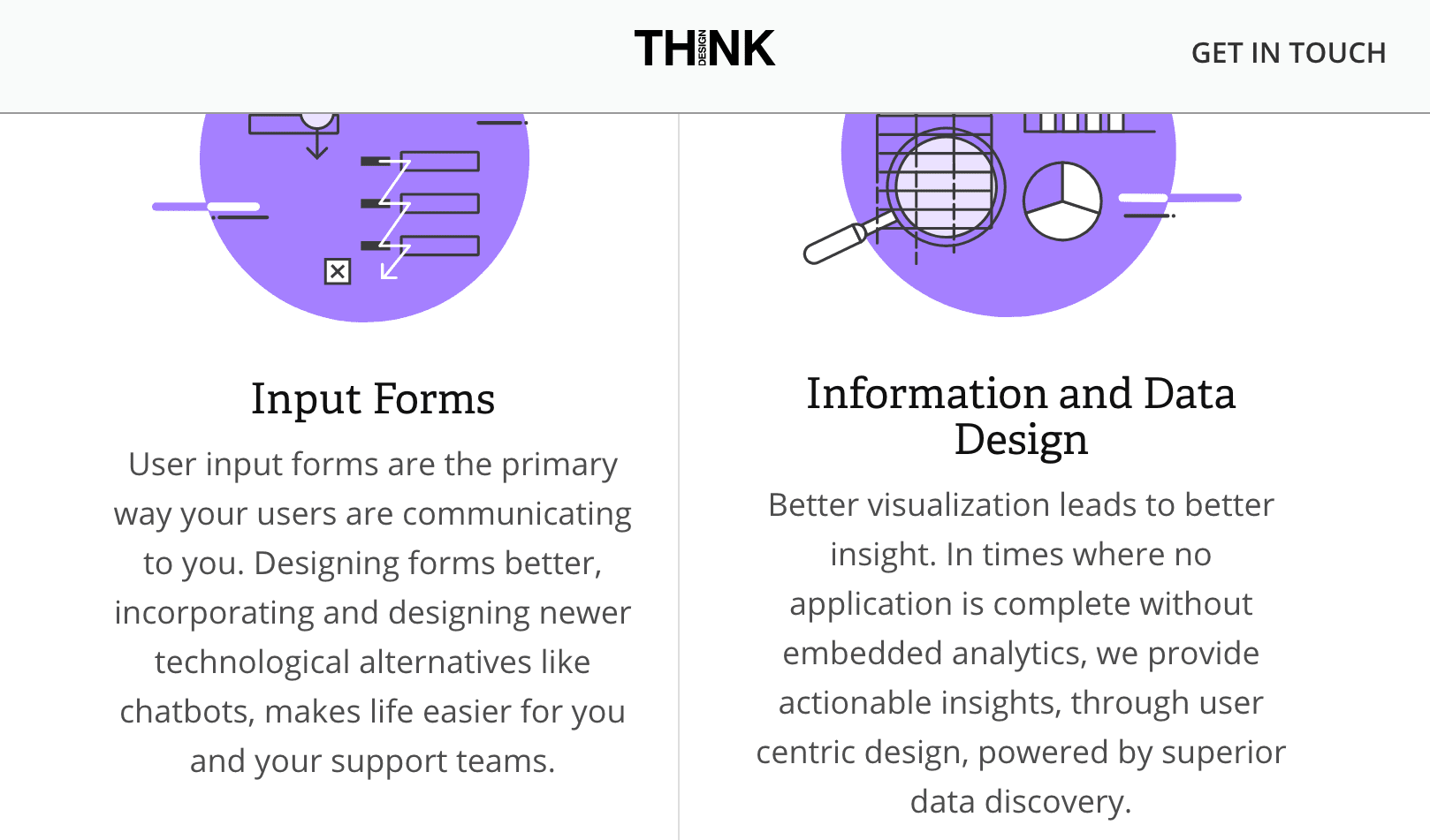
This area is done so well we include another screenshot. The explanations are so helpful in allowing the reader to understand Think Design’s philosophy.

Like many UX companies, Think Design includes its portfolio in tiles.

The explanation of each portfolio case study is well done.

This explains the process that, Like many UX companies, Think Design went through in its design.

This explains what the goal was for the website QuaQua. It all sounded great. I am a person who faces the issues that are described as the case for developing the site, and I agree with the explanation.

However, when I went to the QuaQua website, I did not find that it measured up to Think Design’s explanation of what QuaQua would be able to do. QuaQua only excelled in its videos — which were outstanding. The videos on Indonesia were the best I had ever seen. However, I could not see using QuaQua as a travel platform, which is the site’s intent — that you would both do research and book your travel on one website.

QuaQua’s superlative videos.

Once I got into the booking area, I found the experience not good. Also, the icons and text bleed over into other elements on the website. This shows the importance of reading about what a UX company said it did and checking the work.

More great videos on the QuaQua website.

Another profile case study showed what looked like an excellent example of their work, but I could not check it as it was not a website or phone app.
The Blog

The blog articles were well-formatted. However, I ran into a strange design element.

Each page in the blog has a “continue reading” button. I don’t see what purpose this button has except to make the reader select the button every time. I would remove that button.
The blog articles were overly concise and did not demonstrate much insight. They don’t look like Think Design put much effort into them. Reading about 1/2 of their articles, I did find one quote that was worthy of mention.
Netflix launched an original series called Orange is The New Black in 2013. The show received instant popularity not due to mere chance but due to the analysis of Netflix’s viewer data that revealed coveted viewership trends. It was found* that a large percentage of Netflix viewers were intrigued by dark comedies, stories about prison and crime and appreciated a female lead character as a protagonist. All the things which made the perfect recipe for Netflix to gain double the viewership as from its last two original shows.
Leveraging user behavior data, (data that is generated by, or in response to, a customer’s engagement with a business), Netflix was able to differentiate itself through the personalization of data that it offered.
Yet of the 700 million websites that exist, 72% fail to consistently engage users or drive conversions. Of the 1.6 million apps available, just 200 account for 70% of all usage**. Year by year statistics indicate recurrent failures in creating meaning from the mass of growing data which is available to be converted into business insights.
That was fascinating — but now that I think it through, that was supposed to be the Netflix advantage or the streaming advantage – that they could use the statistics of viewing to create new shows. However, it is curious how infrequently Netflix has been able to produce hits from these statistics. I can’t think of many Netflix original shows that have been big hits. I would say that Orange Is the New Black is the exception rather than the rule.
Conclusion
The Design Think site looks good. Its UX is good. But it falls on its articles, which don’t show thought leadership, and also its portfolio. But overall, it creates a very professional impression.
Overall, we rate the Think Design website an 8 out of 10.